
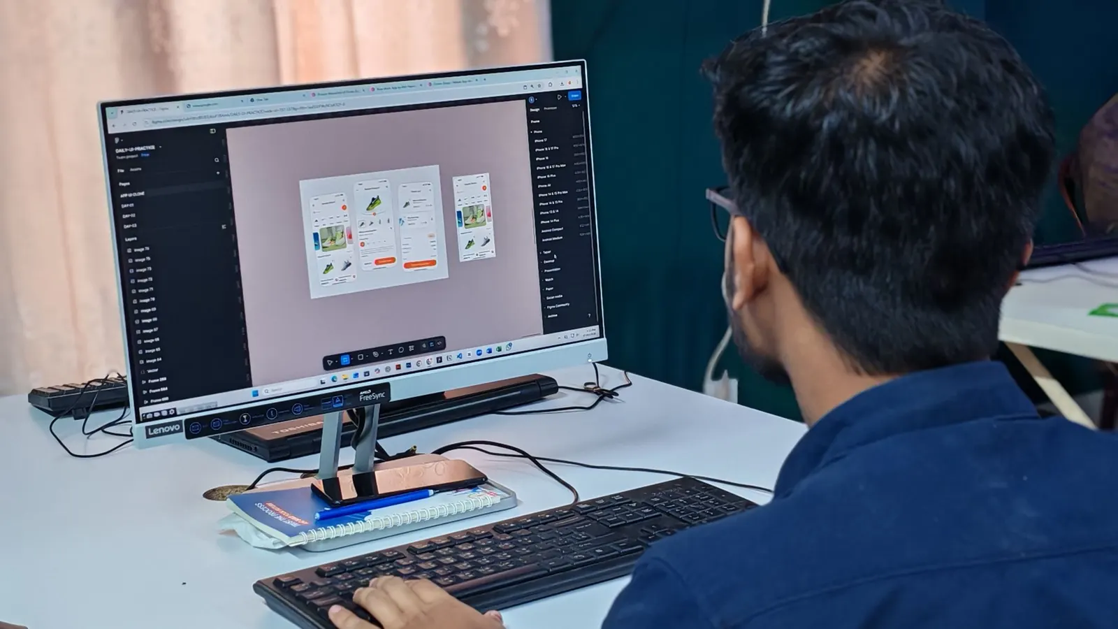
In 2026, UI/UX design in India costs roughly 8,000 to 25,000 rupees a screen at an agency, 3,000 to 12,000 with a freelancer, or by project: 1 to 3 lakh for a UX audit, 2 to 6 lakh for a focused app or MVP, and 6 to 15 lakh for a product with several user types and a design system. Those are the market's numbers, and the per-screen ones are the ones people search for. They are also the least useful way to buy design, and the first half of this guide is about why: a "screen" is four to six states, the visible screen is about a quarter of the work, and the cheapest quote is usually the one that priced only the happy path.
The quick-reference table
| Scope | What it includes | Typical range (INR) | Typical range (USD) | Timeline |
|---|---|---|---|---|
| UX audit of an existing product | Analytics review, watching people use it, a prioritised fix list with effort against each | 1 to 3 lakh | $1,200 to $3,600 | 2 weeks |
| Marketing website, 5 to 15 pages | Structure, copy layout, responsive pages, a small component set | 40,000 to 2 lakh | $500 to $2,400 | 1 to 3 weeks |
| Focused app or MVP, 15 to 30 screens, one user type | Light research, flows, wireframes, screens with states, a clickable prototype, hand-off | 2 to 6 lakh | $2,400 to $7,200 | 2 to 4 weeks |
| Product with several user types, 40 to 80 screens | Research, flows per role, a design system, usability testing, hand-off and support during the build | 6 to 15 lakh | $7,200 to $18,000 | 4 to 8 weeks |
| Enterprise or regulated product | Deep research, compliance-driven flows, several platforms, accessibility audits | 15 lakh and up | $18,000 and up | 8 weeks and up |
Hourly rates behind these numbers run 800 to 2,500 rupees for freelancers and 1,500 to 4,000 for agency designers, roughly $20 to $50, against $80 to $150 in the US and Western Europe. Design is usually 15 to 25 percent of a build budget, which is the proportion to check any full-project quote against, whether it is for an app or a SaaS platform.
Why per-screen pricing misleads
Per-screen pricing is popular because it is easy to compare. Count the screens in your head, multiply, done. It misleads for two reasons.
The first is that a screen is not one thing. A list screen has an empty state before there is data, a loading state, an error state, a state for when the list has ten thousand rows, and a state for the user who can see the page but is not allowed to act on it. That is five designs sold as one, or, on a cheap quote, one design and four surprises during the build.
The second is that the screen is the last quarter of the work. Before it come the decisions: who the users are, what they are trying to do, in what order, and what happens when it goes wrong. After it comes the hand-off: the tokens and components engineers build from, and the designer sitting with them while they do. An agency that prices per screen has either folded all of that into the per-screen number, which makes the number meaningless, or left it out, which makes the product worse.
The useful unit is the flow, not the screen. "Sign up, add a vehicle, book a service, pay" is a thing you can test with five people before anyone draws a pixel. "Twenty-two screens" is not.
Where the money goes: a worked estimate
Here is an estimate for a focused app: a customer-facing mobile app with about 30 screens, one user type, payments, and a light admin view, the way we would break it down after discovery.
| Work package | Person-days | Share of budget |
|---|---|---|
| Discovery and research: stakeholder interviews, five user conversations, a competitor pass | 4 | 13% |
| Flows and information architecture | 3 | 9% |
| Wireframes for every screen, including states | 5 | 16% |
| Usability test on the wireframes with five users, and the revisions it causes | 3 | 9% |
| Visual direction and design system foundations: type, colour, spacing, core components | 4 | 13% |
| High-fidelity screens with their states | 8 | 25% |
| Clickable prototype | 1 | 3% |
| Hand-off: tokens, specs, assets, and time with the engineers during the build | 4 | 12% |
| Total | 32 |
At a blended 12,000 rupees a person-day, mid-band for an experienced Indian design team, that is just under 4 lakh, inside the "focused app" row above. Divide it by 30 screens and you get about 13,000 a screen, which is where the agency per-screen figures come from. But look at where the days went: the high-fidelity screens, the thing a per-screen price claims to sell you, are 8 of 32 days. The other 24 are why the screens are right.
With two designers it takes three to four weeks. A single designer takes six, and the calendar matters more than people expect, because the engineers are usually waiting.

What a "screen" hides
If you take one thing from this guide into a quote review, take this table. Every screen in a real product has most of these, and a design that does not include them is not finished; it is deferred to an engineer who will improvise it at eleven at night.
| State | Why it matters | How often it is missing from a quote |
|---|---|---|
| Empty | It is every new user's first impression of the feature | Usually |
| Loading, including the slow case | Two seconds of nothing reads as "broken" on a slow connection | Usually |
| Error | What went wrong and what to do next, in words a person understands | Often |
| Too much | A forty-character name, a list with ten thousand rows | Almost always |
| Permissions | The user who can see the page but cannot act on it | Almost always |
| Offline or partial | What survives when the network drops halfway through a form | Almost always |
Then multiply by the things that are not states. Responsive layouts for a phone, a tablet and a laptop are separate designs of the same screen. A Hindi or Marathi label is often 30 to 50 percent longer than the English one, and a layout that only survives English breaks on the first translation. Dark mode doubles the colour decisions. Accessibility, contrast, focus order and touch targets big enough for a thumb on a bus, is not a state but it touches every one of them. Most of our clients' users are on mid-range Android phones on imperfect connections, and that is a design constraint from the first wireframe, not a QA finding at the end.
The six things that move the price
- The number of user types. A customer app is one product. A customer app, a vendor app and an admin console are three, sharing a design system but not screens.
- Research depth. Five user conversations and a competitor pass is a few days. Field research, diary studies and several rounds of testing is weeks, and is worth it for products where a wrong assumption costs a rebuild.
- Platforms. iOS and Android can share most designs with platform-specific components; web adds responsive layouts; a tablet-first product for field staff is its own design.
- Whether you need a design system. Worth building when more than a couple of people will make interface decisions, or the product will grow for years. It adds a week or two now and saves every week after.
- Brand and motion. Custom illustration, animation and a new visual identity are separate work from product design, and often quoted as if they were included.
- Decisions not yet made. Changing a flow in a wireframe costs an hour. Changing it after the screens are designed costs a day. Changing it after it is built costs a week and a difficult conversation. The most expensive design projects are the ones where the client decided what the product was during the visual design stage.
Freelancer, agency or in-house
| Option | What you pay | Fits when | The risk |
|---|---|---|---|
| Freelancer | 800 to 2,500 an hour, or 3,000 to 12,000 a screen | A small, well-defined scope with someone technical to direct it | One person, one style, and nobody sitting with the engineers |
| Agency | 1,500 to 4,000 an hour, or a fixed project price | A product with research, several user types, or a design system | The senior designer pitches and a junior one draws; ask who is on the file |
| In-house designer | 8 to 20 lakh a year fully loaded, more in metros | A product that changes every week for years | Two to four months to hire, and a single person cannot cover research, UI and systems equally |
| Monthly retainer | 50,000 to 2 lakh a month | Ongoing improvements to a live product | Scope drift, if there is no backlog and no measure of what shipped |
For a first version, the agency or a strong freelancer plus a technical founder are the usual answers. In-house starts to make sense once the product has customers and the backlog is permanent.
How design is priced, and what to watch for
| Model | How it works | Watch for |
|---|---|---|
| Per screen | A rate multiplied by a screen count | States, responsive layouts and revisions priced separately, and a screen count that grows |
| Hourly | Time billed as it happens | No cap and no definition of done; fine for audits, risky for whole products |
| Fixed price after discovery | A short discovery, then a fixed scope and price | A fixed price quoted before anyone has asked what the product does |
| Retainer | A monthly fee for a designer's capacity | Whether there is a backlog and someone deciding what goes on it |
We work on the third model. A week of discovery produces flows, a screen and state inventory, and a fixed price, so the number you approve covers the product rather than a count of rectangles.
The costs that are not in the quote
| Cost | Typical size | When it surprises you |
|---|---|---|
| Revision rounds beyond the scope | 1,500 to 5,000 a screen per round | When the third round of feedback arrives from a stakeholder who missed the first two |
| Illustration, icon and photo licensing | A few thousand to a lakh | When the placeholder illustrations turn out to be someone's paid library |
| Font licensing | Free to tens of thousands a year | When the typeface in the mock-ups needs a licence to ship in an app |
| Usability test participants | 500 to 2,000 per participant in incentives | When "we will test it" needed real people who were not on the team |
| Time with the engineers during the build | 10 to 15 percent of design effort | When the designs are handed over and the questions start |
| Design debt | Weeks, later | When the engineers improvised the missing states and the product now looks like three products |
| Localisation | Days per language | When the second language breaks half the layouts |
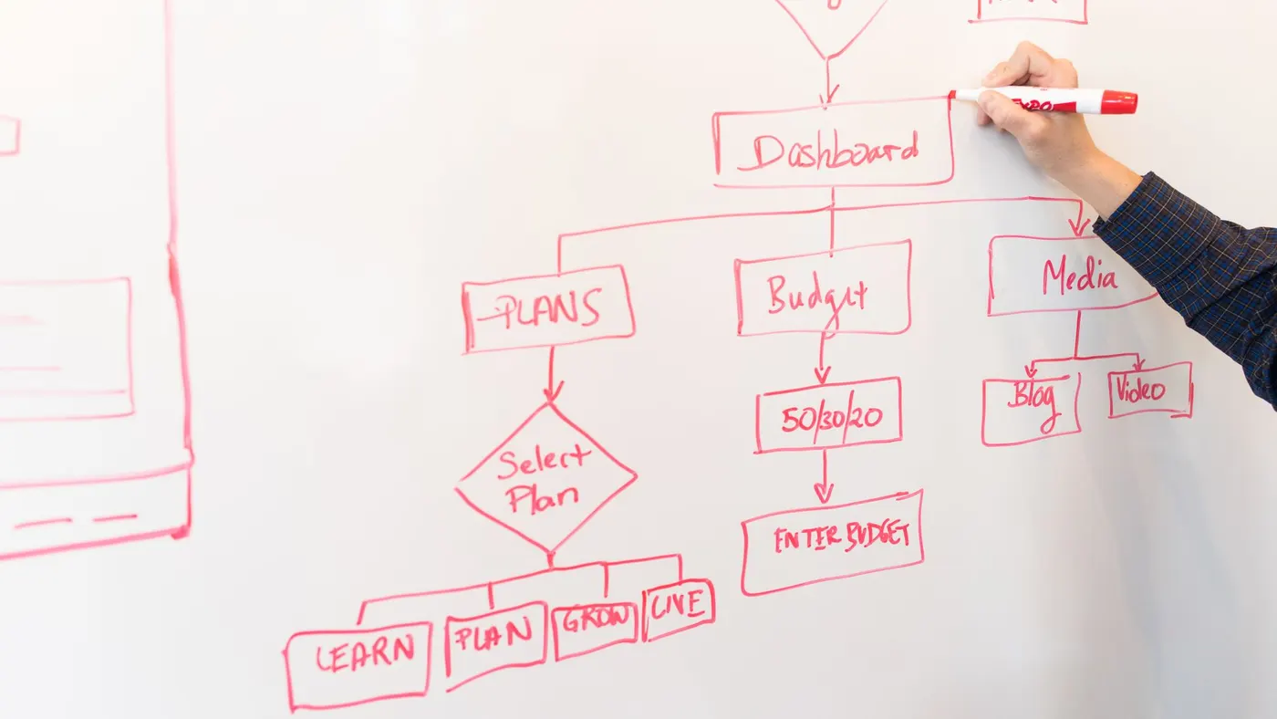
Is AI making design cheaper?
Production, yes. Wireframing, producing variants, exporting assets and turning a Figma file into working components have all got faster, and the design-to-code step in particular has shrunk from days to hours on the projects where we use it. We rebuilt this website in three days, design included, and the honest account of what that took is in the rebuild case study.
Decisions, no. Knowing which three screens matter, what the empty state should say, and why users drop out of onboarding is judgement, research and testing, and the tools do not do those. Our own products taught us that lesson expensively: onboarding is a feature with a design, a budget and a test plan, not the week before launch, and we wrote about the version of that mistake we made in four products in, what we got wrong. The result is that per-screen prices have drifted down a little while the price of getting a product right has not, and any quote that claims AI has made the whole thing cheap by half has priced the production and skipped the decisions.
How to read a design quote
Five checks, ten minutes.
- Count states, not screens. Ask whether empty, loading, error and permission states are included for each screen. If the answer is "where needed", ask who decides.
- Find the research line. If there is none, the designer is guessing on your behalf. That can be fine for a two-week landing page; it is not fine for a product.
- Ask what happens during the build. Designs handed over with no time budgeted for engineer questions get reinterpreted. Ask for the hours, and who answers them.
- Ask who is on the file. The portfolio and the pitch are usually a senior designer. Ask who will actually draw your screens.
- Ask who owns the Figma file and the components. All of it should be yours, in your workspace, from day one.
How to spend less without a worse product
- Audit before you redesign. If the product exists, two weeks of watching people use it usually finds three screens and a sign-up flow to fix, not a visual overhaul. Our UX audit starts there.
- Test the wireframes, not the screens. Five people on a paper prototype find the same problems as fifty on a finished one, a month earlier and a lakh cheaper.
- Use a component library for internal tools. Admin panels and operations consoles do not need custom visual design; they need clear flows on top of a good library.
- Limit custom illustration. It is the most expensive pixel in the budget and the first thing to date.
- Design the boring screens first. Settings, errors, permissions and the admin view are where products fail; the hero screen can wait.
- One platform first. Design for the phone your users own, and add the tablet and the web when they ask for them.
Questions people ask
How much does UI/UX design cost per screen in India?
Agencies quote 8,000 to 25,000 rupees a screen and freelancers 3,000 to 12,000, with complex screens such as dashboards and data tables above those ranges. Check what a "screen" includes before comparing: states, responsive layouts and revisions are the usual exclusions, and the worked estimate above shows why the visible screen is only about a quarter of the work.
How much does app design cost in India?
A focused app with one user type and around 15 to 30 screens costs 2 to 6 lakh to design in the Indian market, over two to four weeks. A product with several user types and a design system costs 6 to 15 lakh over four to eight weeks. Design is usually 15 to 25 percent of the total build cost, so a 20 lakh app should carry 3 to 5 lakh of design.
How much does website design cost in India?
A marketing website of 5 to 15 pages costs 40,000 to 2 lakh to design, depending on whether the pages are laid out from a template or designed around your content and brand. Larger sites with a content system, or an e-commerce front end, are priced as products rather than pages. That is design only; the cost of designing and building the whole site, with a worked estimate, is in our website development cost guide.
What is the hourly rate for UI/UX designers in India?
800 to 2,500 rupees an hour for freelancers and 1,500 to 4,000 for agency designers, roughly $10 to $50, with senior specialists above that. Hourly makes sense for audits and ongoing work. For a whole product, a fixed price after discovery protects both sides better.
How long does UI/UX design take?
Two to four weeks for a focused app or MVP, four to eight for a product with several user types and a design system, and two weeks for a UX audit. Research adds a week, and it is usually the week that saves three later. The week-by-week version, including where design sits in the build, is in how long an MVP takes.
Is UX research worth it for a small app?
Five user conversations and a wireframe test cost a few days and change the product more than any other few days in the project. Full research programmes are worth it when a wrong assumption would mean a rebuild, which is true of regulated products and anything with an unfamiliar audience. What is never worth it is skipping research and calling the visual design stage "validation".
Should I pay for a design system?
If more than a couple of people will make interface decisions, or the product will grow for years, yes. A design system is tokens, components and written rules that engineers implement once and reuse, and it is what keeps the third feature looking like the first. For a two-week landing page or a throwaway prototype, a component library and a page of rules is enough.
Getting a real number
Ranges end where your screens and states begin. We fix a price for design after a one-week discovery that produces the flows and the full screen and state inventory, so what you approve is the product, not a count. Design is included in our app and SaaS projects and can be bought on its own when your engineering is covered; the process is on our UI/UX design page.